
Colour is one of those things you might not consciously notice when you’re watching a beautiful food video, but you definitely feel it. Warm, earthy tones can make a recipe feel cosy and comforting. Bright, fresh colours can make something feel energetic and summery. Muted tones can create something more sophisticated and editorial. And when colour isn't working? You can often feel that something looks "off" without quite knowing why.
The good news is that you don't need to be a colour expert to create beautiful, cohesive food content. Understanding a few simple principles can help you make better decisions about your food, props, backgrounds and overall styling, and make your videos feel much more intentional.
Why colour matters in food content
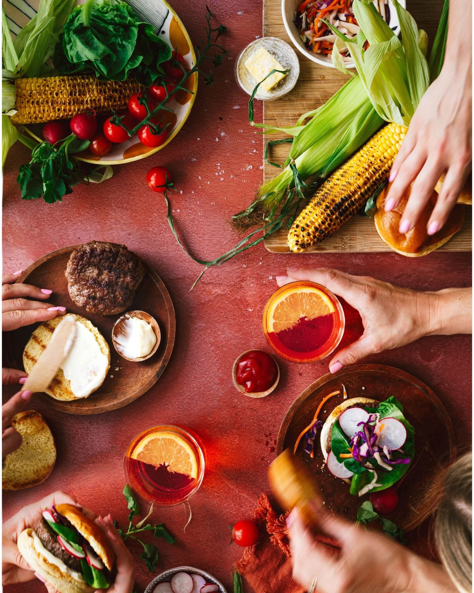
When you're creating a food video, colour isn't just decoration. It's part of the story. Think about a bright green pesto, a deep red tomato sauce or golden-brown roast potatoes. The colours of the food itself already tell us something about what we're looking at. Then you add your plate, napkin, chopping board, background and props. Suddenly, you're working with a whole palette. The trick is making sure those colours are working together rather than competing with one another. You don't need every element to match. In fact, matching everything can sometimes make a scene feel a little too deliberate. Instead, think about creating a relationship between your colours.
Start with the food
One of the easiest mistakes to make when styling food content is choosing your colours before considering the food itself. Instead, start with your hero. What colours are already present in the dish?
Is it:
Warm and golden?
Fresh and green?
Deep and rich?
Bright and colourful?
Pale and neutral?
Once you've identified the dominant colours in your food, you can start thinking about everything around it.
For example, if you're filming a vibrant red tomato pasta, you probably don't need a bright red plate and red napkin competing with it.
A more neutral setting might allow the food to become the star.
This is one of the simplest ways to make your food pop on camera.
Choose a simple colour palette
You don't need to use lots of different colours to make an interesting scene. In fact, limiting your palette can often make your content feel more polished. Try choosing:
One dominant colour
This is the colour that appears most strongly in your scene.
One or two supporting colours
These complement the dominant colour without taking attention away from the food.
A neutral
Think white, cream, beige, grey, brown or another understated shade that gives the eye somewhere to rest.
You don't have to follow this formula rigidly, but it's a useful starting point if you often find yourself throwing props onto a set without knowing when to stop.
Warm vs cool colours
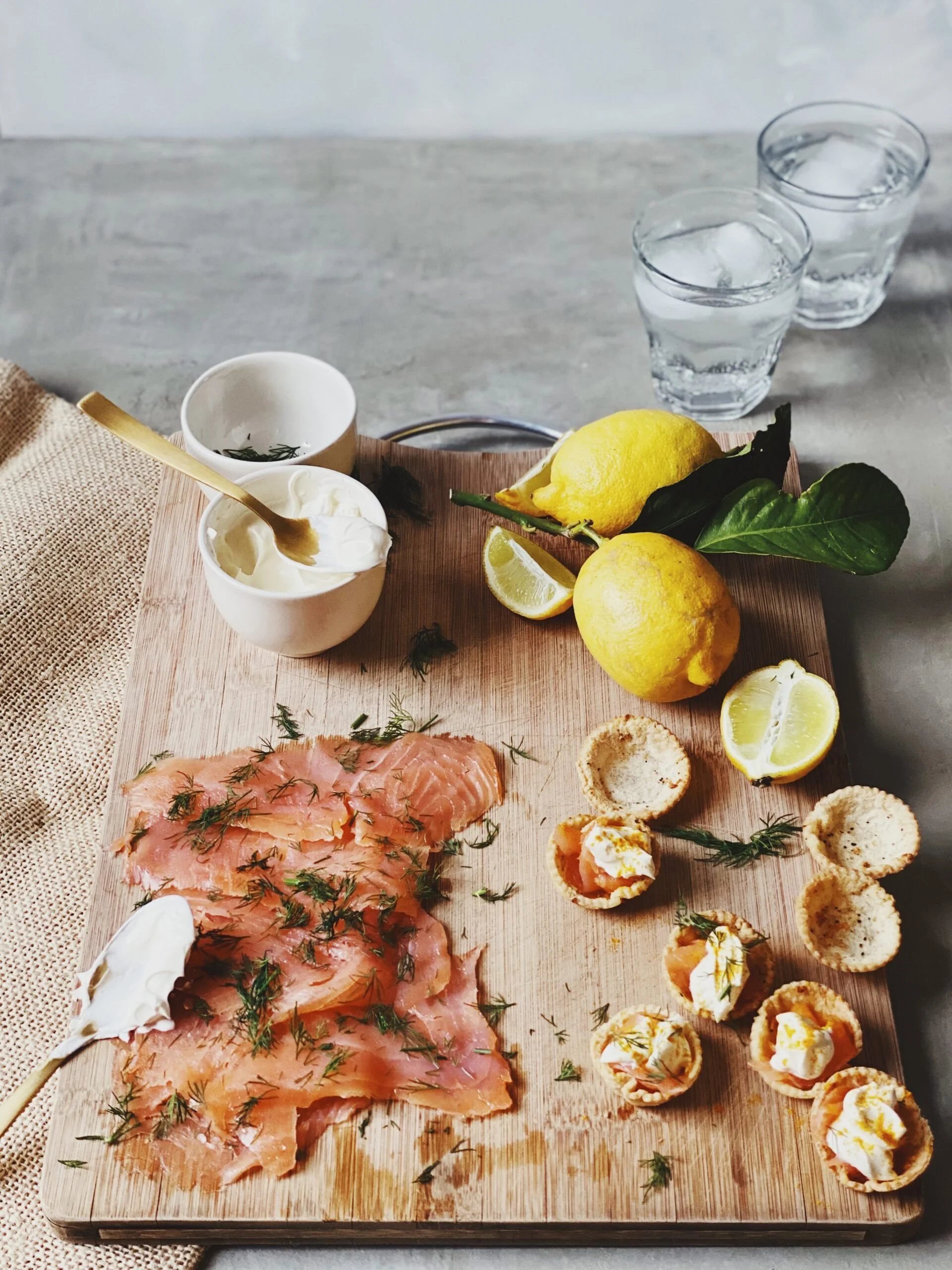
Colour temperature can have a surprisingly big impact on the feeling of your video. Warm colours, such as reds, oranges, yellows and warm browns, tend to create a feeling of warmth, comfort and cosiness. Cooler colours, such as blues, greens and some purples, can feel fresher, calmer or more contemporary. This doesn't mean you should only use warm colours with comforting food or cool colours with fresh food. It's about understanding the feeling you're creating. A winter soup might look beautiful surrounded by warm, earthy tones. A fresh summer salad might benefit from cooler greens, crisp whites or brighter colours.
Think about the mood you want the viewer to feel, rather than simply asking which colours "look nice”.
Don't be afraid of neutrals
Neutrals can be incredibly useful in food photography and video. White plates, linen napkins, wooden boards, stone surfaces and muted backgrounds can create a quiet backdrop that allows the food to take centre stage. This is particularly useful when your food is already colourful. If your dish contains lots of different colours, adding even more colour through your props can quickly make the frame feel busy. Sometimes the most effective choice is to take colour away.
Use contrast to make your food stand out
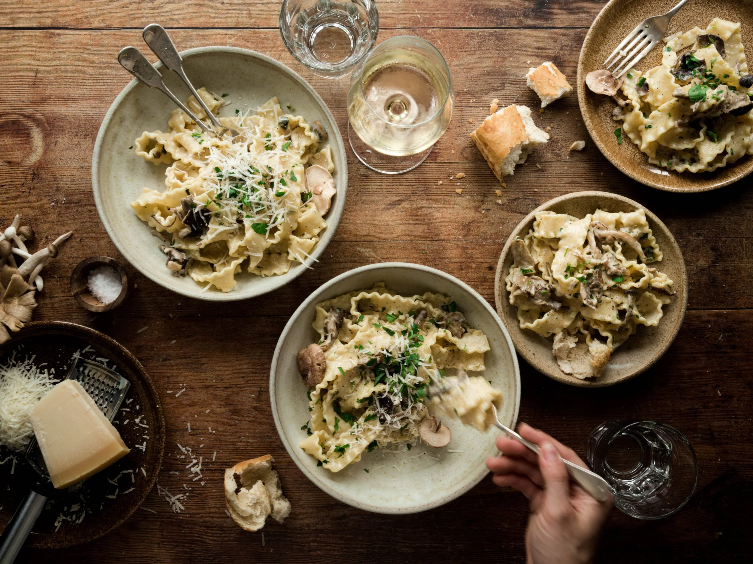
Contrast is one of the easiest ways to create visual interest. If your food is light, placing it against a darker surface can help it stand out. If your dish is dark and rich, a lighter background can create separation. The same principle can apply to individual ingredients. Think about a creamy pasta topped with bright green herbs. Or a dark chocolate cake dusted with white icing sugar. The contrast makes the details easier to see, and often makes the food feel more visually appealing. When you're reviewing your own footage, ask yourself: what is my eye drawn to first? If the answer isn't the food, your colour choices might be part of the problem.
Complementary colours can create impact
You don't need to memorise colour theory to use complementary colours. Essentially, complementary colours sit opposite each other on the colour wheel. Because they contrast strongly, they can create a vibrant and eye-catching combination. A classic example is red and green. Think tomatoes and basil. Or strawberries and mint. These combinations work naturally in food because they're already found together in ingredients, but you can also introduce complementary colours through your styling. The key is restraint. You don't need equal amounts of both colours. Often, allowing one colour to dominate and using the complementary colour as a small accent creates a much more sophisticated result.
Colour can help create consistency across your content
If you're creating content regularly for Instagram, TikTok or your own business, colour can also become part of your visual identity. You might notice that some creators consistently use:
Warm, earthy tones
Soft neutrals
Bright, colourful props
Dark and moody backgrounds
Clean whites and pale colours
This doesn't mean every video has to look identical. Instead, having a general colour direction can make your content feel more recognisable when someone sees it in their feed. You can start by looking at your existing content.
What colours appear again and again?
And perhaps more importantly:
Which colours do you actually love working with?
Your visual style doesn't have to be manufactured from scratch. It can evolve from what you naturally gravitate towards.
Want to create more intentional food videos?
Understanding colour is just one part of creating food content that feels polished and intentional. When you start bringing together lighting, colour, composition, movement, styling and editing, you can create videos that feel much more considered, without needing a huge collection of equipment or years of experience. That's exactly what I teach inside The Motion Method: my Food Videography and Reels Course designed to help you understand the decisions behind creating beautiful, engaging food videos, rather than simply copying someone else's setup.
And if you're looking for a more practical starting point, The Motion Tool Kit gives you a collection of ideas and tools to help you create your videos more easily, including shots, transitions, composition and framing ideas, ASMR, audio, sound effects and editing scenarios.

